Showing posts with label economic growth. Show all posts

Saturday, September 17, 2011

Macro Graph Dump: BRIC - 18 Sep 2011

Here's a couple BRIC [Brazil Russia India China] economic charts, and a few throw-away thoughts on emerging markets in general.

1. BRIC Y/Y GDP Growth
The BRIC economies have made an obvious bounce-back from the GFC, but the notables are Russia and Brazil. Russia has seen certain less sustainable bits of its economy falter and is currently sustaining growth at sub-pre-crisis levels. Brazil got a good boost thanks mostly to the low base comparator effect and is settling into more normal growth... India and China are powering along as per usual.

2. BRIC Inflation
On the inflation front, rising prices remains the greater problem for many emerging markets. There have been some tentative signs of a peak in inflation rates in places like China and Russia. But India is still seeing some inflation impulse (and just recently hiked interest rates again). Keeping a keen eye on the inflation-growth mix in these economies.

3. BRIC Monetary Policy Rates
The key bit to watch with the growth-inflation mix is the monetary policy track. Brazil announced a shock cut to its selic rate recently, which means either political pressure is hitting or the BCB knows something we don't. As noted India is still in tightening mode, while Russia did some tinkering around the edges last week with policy rate bands. China seems to be on hold for now and likely wont ease in the near term. Very interesting area to monitor, these emerging markets are much better positioned on a monetary policy front to meet a slow down in growth cf. developed markets who're delving into the monetary dark arts.

Sources:
+Various statistics & news websites

Saturday, June 19, 2010

China Announces Yuan (CNY) Flexibility

So China has just announced that it will "Further Reform the RMB Exchange Rate Regime and Enhance the RMB Exchange Rate Flexibility". See the full statement here.

Just what exactly this means remains to be seen, but this is a very positive move, and from a global economic stability standpoint will now allow some of the focus to be shifted towards some of the other sources of imbalances like US (and other developed nations) profligacy both on consumer finances and government finances.

But more on the announcement, and some clues as to what might follow... Here's what happened last time (for some more background on the CNY click here):

They have already explicitly ruled out a large one-off revaluation.
"China´s external trade is steadily becoming more balanced. The ratio of current account surplus to GDP, after a notable reduction in 2009, has been declining since the beginning of 2010. With the BOP account moving closer to equilibrium, the basis for large-scale appreciation of the RMB exchange rate does not exist."
They also noted that the daily +/- 0.50% band will not change:
"In further proceeding with reform of the RMB exchange rate regime, continued emphasis would be placed to reflecting market supply and demand with reference to a basket of currencies. The exchange rate floating bands will remain the same as previously announced in the inter-bank foreign exchange market."
So, we're left with no change to the band, and no large one-offs. This leaves a few possibilities like changes in the basket of currencies to which the yuan is pegged. But most likely it will just mean that the authorities there will take a slightly more hands-off approach to the Yuan. So for example we could see a series of daily 0.50% moves. So this may end up in a more flexible market driven state. But of course the point of a market is that prices can move (up or down) depending on demand and supply - and relative prices. So there could even be scope for a depreciation of the Yuan against some currencies.

But above all this remains a very positive development in terms of financial and economic reform in China, and a vote of confidence in the Chinese economy:
"The global economy is gradually recovering. The recovery and upturn of the Chinese economy has become more solid with the enhanced economic stability. It is desirable to proceed further with reform of the RMB exchange rate regime and increase the RMB exchange rate flexibility."
And indeed, a vote of confidence in the global economic recovery. The move will also serve to assuage some of the protectionist sentiment that had been rising e.g. US tariffs etc. This is important, because protectionism needs to be avoided at all cost in ensuring the recovery. But above all this announcement may herald the rise of a truly sustainable, and structural global economic recovery.

Sources
Econ Grapher Analytics www.econgrapher.com
People's Bank of China www.pbc.gov.cn
Yahoo Finance finance.yahoo.com

Article source: http://www.econgrapher.com/20jun-cnyflex.html

Monday, June 7, 2010

3 Tiered Economic Recovery: a Stock Index Survey

Is there a 3 tiered global economic recovery under way? And how might stock market performance look?

The other day I noted in a comment on seeking alpha (an extension of ideas in the latest top 5 graphs article) the possibility for the existence of a 3-tiered global economic recovery. The basic idea is that there are 3 tiers in this recovery, with emerging markets leading (and developing economies following):
  1. Emerging Markets
  2. Lucky Developed Economies
  3. Unlucky Developed Economies
Basically this is simplifying the notion of an uneven recovery down to 3 categories (also could be called fast, medium, and slow). The lucky/unlucky comment is a bit facetious, but it refers to the divergence in prospects between developed economies such as Australia, South Korea, Poland, Canada, and New Zealand; and the older developed economies such as most of Europe, the UK, US, and Japan. While the first tier contains most emerging markets.

This divergence is driven by a number of factors such as existing and new vulnerabilities created by fiscal positions and government borrowing. But it also refers to factors (the lucky part) such as a fundamentally strong economy, and benefit from recovering commodity prices, and to a lesser extent global trade volumes.

Of course there are risks to all 3 tiers, and you only need to look at 2008 to see how correlated things can get, but I reckon the 3 tiers accurately captures the way the recovery will unfold for the various economies: fast growth, average growth, and low growth (or stagnation).

Stock Market Returns
So enough hypothesizing and proselytizing, let's do as the article title suggested; survey the stock market returns of the supposed 3-tiers. First up is Tier 1 - Emerging Markets; the category which is mostly to see the highest growth rate... The Chart below shows (with ETFs used as proxies where I couldn't find index data) tier 1 has been clocking up some pretty high annual returns (chart shows year on year % change on a weekly basis). But of course it's matched with higher volatility. Note the correlations in the past 2 years.


Next up is tier 2. The first thing to note is that returns are generally lower over the past 5 years than tier 1, another notable point is the higher correlation across the period vs tier 1. The generally lower returns relative to tier 1 will in part reflect the dichotomy of growth prospects (or potential growth rate).


Last but not least is the tier 3 economies, the unlucky ones. The bounce back has been and gone by a quick glimpse at the chart below, and the fundamentals tend to support that notion. Within this group there are those such as Japan and the EU, who may be more vulnerable with greater structural issues to deal with; especially in terms of fiscal positions. Also note that returns are generally lower than both tier 1 and 2; reflecting lower yet potential growth rates.


So what? So we can make a few generalizations like tier 1 generally had higher returns and higher volatility, and generally lower correlations prior to the crisis. But once the crisis hit all markets started behaving pretty similarly (to state the obvious). But there are some clues emerging e.g. looking at the tier 1 and 2 charts you can see the beginnings of a decline in correlations, with each market starting to move slightly different to the rest (in contrast to tier3).

So if I were to pick where things might go, I'd say tier 3 markets will generally show low performance in line with low growth prospects, and possibly lower correlations. Tier 1 will likely show the highest returns, but retain its characteristic volatility; and the past will probably look somewhat like the future in that respect. Tier 2, though, may present a more balanced mix of volatility and returns, tier 2 has reasonable growth prospects, and most tier 2 markets possess the desirable traits of developed economies i.e. good legal system, rule of law, democracy, stability, investor protections, etc. In any event this supposed 3-tier recovery concept will be an interesting one to think about as the fragile, gradual, and uneven global recovery unfolds...

Sources
Econ Grapher Analytics www.econgrapher.com
Yahoo Finance (Historical Index Levels) finance.yahoo.com

Article Source: http://www.econgrapher.com/7june-3tieredrecovery.html

Wednesday, May 5, 2010

US ISM - Manufacturing Takes the Lead

In this article we look at both ISM manufacturing and non-manufacturing indexes and ask "Are there any real indications of a sustainable economic recovery yet?" - with the the obvious implication of the broader economic outlook for the US. As a quick reminder the ISM manufacturing PMI came in at 60.4 (just below consensus 61.0, and above previous 59.6); meanwhile the non-manufacturing index came in at 55.4 (unchanged from March, and below consensus 56.4).

Neither of the headline results were particularly interesting apart from the fact they were both still definitely in expansionary territory. But as you'll soon see, a quick look under the surface reveals some pretty interesting moving parts.


Right, the first thing to note is that new orders shot up from 61.5 to 65.7 (only this time last year it was 47.2), new orders is the leading part of the PMI - it shows how much activity is set to come through the system. It's particularly interesting that the new orders index has stayed so strong for so long - one might expect the easing of the stimulus and inventory cycle effects to start taking a toll pretty soon - but hey, maybe there is some hint of underlying strength starting to show through...

The other interesting line in that chart is the employment sub-index, which has also shown some strength (note the details: 26% say higher employment, only 6% say lower now). The employment index is currently sitting at 58.5 (a reading above 49.8 is generally consistent with expansion of the main employment stats). This aspect also provides some interesting indications in terms of the near term outlook for the US economy.


Moving on to the non-manufacturing index, the results are still positive, but it's clear that the manufacturing sector is accelerating faster. The employment index for the non-manufacturing series is still below 50, but the breakdown is 22% higher vs 17% lower - slimmer margin than the PMI; but still positive. Many are looking for a solid improvement in employment for a recovery to take hold (and this is also probably a pre-requisite to Fed rate hikes), so the signs here are somewhat promising - however this is just one part of the economy, and there are still plenty of risks to the US economic recovery (including external risks!).


The last chart shows the prices indices from both series with the annual change in the Consumer Price Index overlayed (i.e. the main inflation proxy). The point of this is that both price indexes appear to be pretty reliable indicators of headline inflation. The other interesting part is the implications of rising prices: 1. It means that there must be at least some appetite from customers to pay the higher prices, 2. It means that margins may end up improving further (having been assisted by the drop in salary and wage costs - in part driven by the huge job losses seen through the crisis).

So there are some interesting signs coming through in the ISM indices for the manufacturing and non-manufacturing sectors. Sure there are still a lot of significant vulnerabilities in the US economy, and the economic recovery is far from sustainable at this point. But, there are some positive signs in the ISM numbers for April. Indeed it's even tempting to suggest that there are some faint glimmering hints of underlying strength coming through. But again, it's a long hard road to a sustainable economic recovery from here, with many bumps along the way.

Sources
Econ Grapher Analytics www.econgrapher.com
Institute for Supply Management www.ism.ws
Bureau of Labour Statistics www.bls.gov

Article Source: http://www.econgrapher.com/6may-uspmi.html

Tuesday, May 4, 2010

Aussie Monetary Policy Update

The RBA (Reserve Bank of Australia) today said in its monetary policy decision release that it would raise the cash rate by 25 basis points to 4.5%, continuing its path to neutral monetary policy. In the announcement the RBA Governor, Glenn Stevens said:
"With the risk of serious economic contraction in Australia having passed some time ago, the Board has been adjusting the cash rate towards levels that would be consistent with interest rates to borrowers being close to the average experience over the past decade or more. The Board expects that, as a result of today’s decision, rates for most borrowers will be around average levels. This represents a significant adjustment from the very expansionary settings reached a year ago."

Thus the wording is a little bit more cryptic than last time, but it seems like their perception is that inflation tapered off less than expected during the recession; and as such has clearly and firmly turned up (as you can see in the chart below). So with that in mind, and the fact that Q1 inflation was almost 3% (2.9%), one would expect that the tightening shall continue - and if not, that any pauses will be short lived unless any indications surface that point to a slowing of growth. That said, the bank did note that interest rates are close to average, which could be read as "neutral", so the prospects could well be for a pause soon.


Thus, with the strong bounce back that has been seen in Australia; the true strength of the economic recovery will be tested in the coming months as the effects of the fiscal stimulus (home buyer subsidies, cash spending subsidies), and monetary policy stimulus measures wear-off. Then we will get to see how miraculous the Australian economic recovery really is... but for now the outlook is for continued growth, inflation around the top end of the target, and the monetary policy tightening is almost certainly going to be in stop-start mode now.

Sources
Econ Grapher Analytics www.econgrapher.com
Reserve Bank of Australia www.rba.gov.au
Australian Bureau of Statistics www.abs.gov.au

Article Source: http://www.econgrapher.com/4may-rba.html

Thursday, April 29, 2010

Russian Central Bank Drops Rate to Promote Lending

The Russian central bank, Bank Rossii, dropped the refi (refinancing rate) 25bps to 8% in order to encourage loan growth and further stimulate the economy; trading off potential increases in inflation with sustaining the recovery. The move marks the 13th reduction in the rate during the recession; down a total 500bps since the high of 13% in early 2009; but could be the last reduction. The following quotation is from the trusty (or somewhat rusty) Google translate of the announcement (which is only released in Russian):
"Dynamics of the main Russian macroeconomic indicators show a gradual tendency towards the restoration of economic growth. In March, [there was] continued growth in real disposable incomes, [and] increased turnover of retail trade. However, the overall process of economic recovery remains fragile, [and there is] still [the] need to support the dynamics of domestic demand. [As] Observed in March-April, the growth of bank credit [in the] economy is negligible, despite some reduction in rates on loans to MSEs.

In these circumstances, the decision of Bank of Russia is directed primarily to further promote awareness [and use] of credit activity of the banking sector and, ultimately, improving the availability of lending to the real economy."


Of the so called BRIC economies Russia is the only economy still in recession (i.e. still not in positive growth), and logically it is the only one still expanding stimulus measures; with Brazil announcing a 75bp increase yesterday, and along with China and India; increasing the required reserve ratios for the banks. Russia took a significant hit during the crisis as the crash in oil prices hit its energy commodity dependent economy, which of course flowed through to break other bits of the economy as well. Thus a big challenge for Russia will not just be getting its economy back to growth, but also diversifying its economy for a more structural recovery; rather than returning to a dependency on energy commodities - and risking the old "Dutch Disease".


So it will be interesting to see how the growth and inflation picture plays out for Russia this year and beyond, as the strategy of sacrificing possible increases in inflation for higher growth plays through. It may well be that the Russian economy bounces back strongly into growth around 7% especially if oil prices continue to recover or at least remain stable around $80-$90 a barrel. However Russia remains heavily exposed to commodity price volatility, inflation risks, and any further global spillovers. But overall the prospects for Russia are good, you just have to take the volatility with the growth potential, and remember Russian stocks have roughly doubled year on year; so where that leads things next is a point to ponder.

Sources
Econ Grapher Analytics www.econgrapher.com
Bank Rossii www.cbr.ru/eng
Google Translate translate.google.com
Trading Economics www.tradingeconomics.com

Article Source: http://www.econgrapher.com/30apr-russia.html

Tuesday, April 27, 2010

South Korea GDP Continues Strong Rebound

South Korea announced its Q1 2010 GDP results today, with a solid 1.8% growth rate since Q4 2009; beating consensus for 1.5% growth, and 0.2% in the previous quarter. On an annual basis the South Korean economy grew 7.8%, continuing a strong export led rebound from its brief recession as noted in our review of OECD member GDP stats in the weekend.


The Bank of Korea commented in the release that the manufacturing sector saw strength driven by the electronics sector (likely a product of an export recovery, partially driven by restocking, and partially by normalization of demand for what have now become staples). It also noted strength in civil engineering driven construction (stimulus?), so a pretty typical pattern as far as economic recoveries go at the moment:
"On the production side, the manufacturing sector shifted to positive growth rate of 3.6 percent. This was mainly due to an upturn in electrical and electronic equipment manufacturing such as semiconductors and electronic products. The construction sector increased 1.6 percent, propelled by civil engineering. Services rose by 1.5 percent owing to growth in the transport & storage and wholesale & retail trade sectors."
The KRW (Korean Won) is currently trading around 1,100 against the USD after strengthening almost 20% over the past year. Likewise the KOSPI Composite Index is trading around 1,750 having rallied about 30% over the past year as the Korean economy has shown credible resilience through the global financial crisis.

In terms of the outlook for the South Korean economy, the Bank of Korea is forecasting 5.2% (Credit Suisse 6.2%, Barclays 5.7%) growth for 2010. Most analysts expect the Bank of Korea to raise rates from a record low 2% in the second half of the year as it weighs concerns about exiting too early from policy stimulus (and faces increasing pressure and influence from the government).

Recently Moody's also raised its rating for the country to A1, "The Korean economy is responding rapidly to the improving global economic environment, and the government has put in place supportive policy measures which should help sustain economic growth over time,". Thus the comment that South Korea has gotten off lightly from the global financial crisis rings true for now, in terms of its strong fundamentals and geographic advantages (China +ve, albeit North Korea -ve), the Republic of Korea is probably well positioned for future growth.

Sources
Econ Grapher Analytics www.econgrapher.com
Bank of Korea eng.bok.or.kr

Article Source: http://www.econgrapher.com/27apr-koreagdp.html

Friday, April 23, 2010

OECD Economies: GDP Status Check

Where are the OECD economies at in the recovery? In this article we take a unique approach to analyzing the patterns of GDP growth across the OECD economies over the past 12 years. Why? Well for starters it's nearing GDP season (Q1 results will be out soon for a few countries; the UK has already announced its Q1 2010 results). Second, it's useful to occasionally challenge your perceptions about which countries are growing and which aren't. Third, it's a timely status check in terms of the overall recovery across the OECD economies.


The first table shows quarterly GDP growth for the OECD economies that report total GDP (Gross Domestic Product) on a quarterly basis. The economies are ranked by size, and the rules for the heat map are: Green = >0.2% Yellow = >-0.2%<0.2% Orange = <-0.2%. In other words the yellows are where economic growth was pretty much flat, while green indicates growth and orange indicates contraction. The pattern in recent years is unsurprising, but it shows a few standouts that got off lightly during the recession e.g. Poland, Australia, and to a lesser extent Korea. It's also informative to assess the patterns across time.


The second table shows GDP growth on a year over year basis, again with economies ranked by size (this time the rules are similar but with -1%/1% instead of 0.2%) . It's interesting to note that Australia, Poland, and Korea are countries which have left recession on an annual basis, with others like New Zealand, and Luxembourg showing promising signs. Again, eyeballing the history you can see which economies have tended to consistently grow and those that have had more patchy history. You can also see the early 2000 recession, and how it compares to the global financial crisis.

Summary

It is useful and interesting to look at the data from different angles from time to time, because it helps you check your assumptions and beliefs, and it allows you to generate new insights. Some of the questions you can answer by glancing at the tables are: Which economies are growing? Which economies have experienced the most consistent growth? Which economies showed the most strength throughout the crisis? And therefore, which economies might produce the most compelling investment opportunities? The final question can't be fully answered here, but by reviewing the data in a new way, it can begin to be answered.

Sources:
Econ Grapher Analytics www.econgrapher.com
OECD www.oecd.org

Article source: http://www.econgrapher.com/24apr-oecdgdp.html

Wednesday, April 21, 2010

IMF: Recovery Is Stronger than Expected, but Speed Varies

The IMF just released its April 2010 World Economic Outlook; upgrading world output growth projections for 2010 to 4.2% and 4.3% for 2011 (up by about 1% since the 2009 report). The split shows emerging markets very much as the drivers of global growth with forecasts for 6.3% in 2010 and 6.5% in 2011; while the comparable figures for Advanced economies are 2.3% and 2.4% respectively:
"The global recovery has evolved better than expected, but in many economies the strength of the rebound has been moderate given the severity of the recession."


The IMF noted the great rebound in activity indicators; notably in accelerating world trade (a critical aspect for a sustainable recovery - but a risk area as protectionism rhetoric grows). The IMF has picked world trade to grow at 7% in 2010 and 6.1% in 2011 (having contracted -10.7% in 2009):
"Global activity has rebounded, as evidenced by accelerating world trade, industrial production, and retail sales. Employment continues to contract in advanced economies but is expanding again in emerging economies, helped by strong potential growth. Industrial confidence has returned to precrisis levels, but household confidence in advanced economies continues to lag, reflecting subdued employment."


The IMF is reasonably relaxed about inflationary pressures, noting that it sees low levels of capacity utilisation, and well-anchored inflation expectations. That said the IMF view was that inflation in developed economies did not drop-off as drastically as growth did. It also pointed to higher inflation risks in emerging economies (6.2% in 2010 vs 1.5% for advanced economies):
"Inflation pressures are projected to remain low, held down by high unemployment rates and excess capacity. Inflation has been higher and more volatile in emerging economies, and inflation pressures could resurface more easily there than in advanced economies."


The IMF also cited repeatedly throughout the report that high unemployment remains a significant risk to a recovery in global demand, and broader economic growth, and noted it expected unemployment (which it also noted could actually be worse than expected) to remain high in advanced economies:
"High unemployment poses major social problems. In advanced economies, unemployment is projected to stay close to 8.5% through 2011 and then to decline only slowly. Moreover, the problem is even larger than the statistics suggest. Many of the employed are working shortened hours or in temporary jobs with few benefi ts. Others would like to find work but have given up searching and are thus no longer recorded as unemployed in the statistics. There is no single measure for broader unemployment or underemployment, but available data suggest that it can often be higher by 25-50% than headline unemployment rates."


Thus the overall message is that the recovery is indeed underway, albeit uneven. However "activity remains dependent on highly accommodative macroeconomic policies and is subject to downside risks, as room for countercyclical policy maneuvers has sharply diminished and fiscal fragilities have come to the fore." Thus the same challenges remain in macroeconomic policy exit strategies (not least of all sustaining the recovery), and the example of Greece shows on the fiscal front that a clear and credible plan for fiscal sustainability is not just 'nice', but necessary.

Sources:
Econ Grapher Analytics www.econgrapher.com
International Monetary Fund www.imf.org

Article source: http://www.econgrapher.com/april2010-imfweo.html

Thursday, April 15, 2010

Top 5 Graphs: China Grows But Faces Challenges

China just released its quarterly data smorgasboard, showing the nation grew 11.9% year on year in the first quarter of 2010. It also revealed its inflation situation, consumer spending trends, and industrial production activity levels. In this review we analyse each data set in terms of what it means for the outlook for the Chinese economy, we also look at the quarterly figures for Chinese international trade.

1. GDP lifted further by stimulus
The Chinese growth miracle continued into the first quarter of 2010 with 11.9% GDP growth year over year. This compares to an expected 11.7%, and Q4 09 of 10.7%, and much improved compared to Q1 09 6.1%. However the growth is largely artificial - or to be fair most of it is artificial. If you look at the figures coming out in 2007 which were also in the double digits, that growth rate had been gradually built up to. If you look at the chart below you have a significant drop-off and were it not for the massive stimulus you would see growth stagnating and drifting sideways if not downward like most other economies. The trick is, what happens next? what happens when the stimulus is removed - or in other words, how long will it take for the Chinese economy to -really- recover?

2. CPI - China will face heightened inflationary pressure
China's CPI year on year percent change inflation figure came in at 2.4% against 2.7% in Feb, and -1.2% in March 2009. As I've previously pointed out the probable trajectory for Chinese inflation is up. The leading indicator points to a rapid uptick in inflation, and huge lending growth, and huge money supply growth can only support inflationary conditions. What's more the triple effect of markets; commodities, stocks, and most of all real estate have already started pushing up headline inflation. Unless the People's Bank of China adjusts policy soon, or the yuan policy gets changed, it's likely that China will see a marked pick up in average inflation.

3. Retail Sales - Chinese consumers still buying more
Another interesting piece of information in the release was Chinese retail sales - one of the best measures we have of Chinese domestic consumption. Sales in March were 1,132 billion yuan; down 8% from February (likely to be driven primarily by seasonal factors such as Chinese New Year). Year on year the growth rate reduced to 18%. The March 2009 figures were 932 billion yuan (up 14.7% year on year). So what we have overall though is increasing growth in domestic consumption. The overall volume of sales is still growing, but also the rate of growth is returning to pre-crisis levels. But then again; were it not for subsidies e.g. appliance purchases, perhaps volumes would have gone sideways.


4. Industrial Production - Helped by consumption, stimulus, and exports
Chinese industrial production picked up further in March to 18% from February's 13%. Again this is an obvious after effect of massive stimulus spending. But it is also benefiting distinctly from the global inventory cycle and related pick up in international trade. Chinese exports (and imports) have recovered strongly since the bottom, but also - there is the domestic spending aspect to it. As you saw above, Chinese consumers have kept on spending and at increasing rates - so obviously production needs to occur to meet demand. But slicing and dicing it these ways really just shows that it's not all that fundamentally driven yet - so where's the real recovery? (where is the structural recovery?).

5. International Trade - Interesting patterns unfolding
One of the most contentious issues these days is the yuan and China's international trade. The March quarter saw China's lowest surplus in about 4 or 5 years, due to exports recovering slowly, but demand for imports rising (and prices of key imports i.e. commodities, rising). But the long term trajectory of China's trade figures is up, up, up. Where its surplus goes will be determined largely by the global recovery, but also its trade policies and strategies. In the longer term, as a low cost competitor China will eventually lose some market share as production of exports shifts to lower cost developing and emerging markets. So that leaves China with some interesting strategic challenges.

In summary, it's always great to get more data from China. It is after all the world's second largest economy, and most populous nation. The long term growth story for China remains intact, short term issues though they may face; not least of all sustainability (environmentally and otherwise). The trend has been for retail sales to grow, this is good for potential import growth and for those investing in the right consumer products companies. The trend has also been for consistently high economic growth, this is good for the Chinese, and those who trade with them.

In the shorter term, the trend has been for increasing inflation, and massive - massive stimulus spending and policy measures. These aren't necessarily bad things - but they must be kept firmly on the radar. They pose threats and opportunities for the various interest groups and stakeholders (think about this). Also in the short term, trade has taken an interesting - but likely transitory - pattern of reversing into greater import growth than exports. These two issues paired with the Yuan policy make for an interesting mix for this year. Keep watching...

Sources:
Econ Grapher Analytics www.econgrapher.com
National Statistics Bureau www.stats.gov.cn

Article Source: http://www.econgrapher.com/15apr-china.html

Saturday, February 27, 2010

Top 5 Graphs of the Week - 28 February 2010

This week we look at GDP; revisions and releases. First up is a look at the revision to the US GDP results for Q4 2009, then there's the first revision to the UK GDP stats. Then we look to some of the fresh data coming from some emerging markets; we've got South Africa, Taiwan, and Thailand, all showing a reasonably strong bounce back from the recession.

At a high level we've basically got the developed nations (US, UK) recording growth on a quarterly basis, but still with poor growth on a year on year basis - and still with significant risks to the recovery and persistent structural problems.

On the other hand you've got emerging markets showing a strong bounce-back from the recession due to a number of drivers such as the global recovery in international trade, government spending, manufacturing, and to a lesser extent consumption. One thing to note though is that in every single case reported here the result beat consensus estimates...

1. US GDP - first revision
The US officially revised its Q4 GDP annualised quarterly growth rate up to 5.9% from 5.7% previously reported (against consensus estimates for no change at 5.7% with a range of 4.2% to 6.3%). On a quarter on quarter basis the rate was about 1.47%, and a year on year basis was 0.1%. So not a huge shift in the headline rate, but some of the details to note include that purchases of equipment and software grew the most in about a decade at 18.2% annualised. Also inventories ended up making an even larger contribution to the growth rate, which shows that it's still very much at this point a temporary recovery; the question is, will it remain a temporary recovery or will it become a sustained, real recovery?


2. UK GDP - first revision
The UK saw its feeble recovery become slightly less feeble with the first revision to Q4 2009 GDP, the figure came in at +0.3% q/q instead of the original +0.1% (and against consensus estimates of +0.2%), placing it down -3.3% y/y. There's nothing much else to say on this one except that it's positive that the number was still positive, and that it beat consensus and previous, but then there's still the 2nd revision to come. It doesn't change the overall picture of a still very weak and struggling economy, where in a previous article I noted that at the moment the UK has high inflation and low economic growth - not a pretty picture.


3. South Africa GDP - growing recovery
First up in the fresh results from emerging markets is South Africa. The economic growth figure came in at an annualised rate of +3.2% (or 0.79% q/q), compared to the previous quarter's result of 0.9% (0.22% q/q) and consensus estimates for 2.6%. Year on year growth was still negative though at -1.63%. The recovery there is being lead by the manufacturing sector, and to a lesser extent mining, with consumer spending being slower to recover. So the recovery is underway in South Africa, but risks remain such as the large divide between the haves and have-nots, and an unemployment rate in excess of 20%.


4. Taiwan GDP - strong bounce back
Taiwan saw a continued strong bounce-back with 9.22% in Q4 2009 vs 2008, against consensus estimates of 7.1%. Looking at data from the Taiwan official stats site the figures were 4.23% growth quarter over quarter, and 8.48% growth year over year. The growth was driven by strong net exports, helped by a recovery in demand for things like cell phones and semiconductors. Domestic consumption also contributed to the strong figures. Taiwan is also no doubt aided by improving relations with the mainland, and progress made on lowering regulations for doing business in China...


5. Thailand GDP -
The Thai economy grew 3.6% q/q in Q4, against forecasts for 1.8%, and previous quarter's result of 1.7%. On a year on year basis the $260 billion economy expanded 5.8% against an expected 4.0%. For the year of 2009 the economy shrank by -2.3%; see the chart below (a mix of IMF and Bank of Thailand stats). The Thai economy is benefiting from a global recovery in exports, and increased government spending, and adds to the picture of a strong recovery of economic growth in Asia.


Summary
To sum up the overall picture from a distance looks roughly like a synchronised global recovery. More and more economies are recording their first, second, or even third quarter of positive quarterly growth, while some are even starting to record positive annual growth (not confined to emerging markets like Thailand and China, the US just broke even on an annual basis).

But to be sure the devil is in the details, if you think about growth potential the emerging market economies are definitely proving to be better positioned for growth than developed markets. Already you're seeing not only strong growth and stronger recoveries, but also stronger drivers and fundamentals. The recovery in emerging markets is starting to happen for the right reasons, rather than short term things like inventory cycle and stimulus.

So the outlook is still for emerging markets to outperform developed markets on the economic growth front, as developed economies deal with structural problems. But one thing that needs repeating is that in this round we're seeing more results beat consensus than not, this says that either people are bad at forecasting the growth figures, or that people are being too pessimistic, and possibly that things are starting to get better...

Sources:
1. US Bureau of Economic Analysis
http://www.bea.gov
2. UK Office for National Statistics www.statistics.gov.uk
3. Statistics South Africa http://www.statssa.gov.za
4. National Statistics Taiwan http://eng.stat.gov.tw
5. Bank of Thailand http://www.bot.or.th & IMF

Article Source: http://www.econgrapher.com/top5graphs28feb.html

Monday, February 8, 2010

How To Read GDP Reports

How To Read GDP Reports
A country’s Gross Domestic Product, or GDP, is one of the most accepted and widely recognized metrics for gauging the level of activity in an economy. Yet there are many pitfalls in analyzing GDP to provide quality insights for investment strategy, market timing, and understanding broader economic themes that are playing out.

This article serves as a primer for those with limited-to-medium knowledge about using GDP metrics, and takes a markets and investment perspective. It’s also intended to act as a bit of a thought starter and I welcome those with extra hints and tips to post them on Seeking Alpha, or the Econ Grapher blog.

GDP Values and Percentages
There’s a range of different values you can look at e.g. PPP adjusted, nominal, real, local currency, and then there’s production versus consumption methods of calculation. The main thing you need to know is that most countries release GDP on a quarterly basis and generally in value terms, but sometimes in the form of indexes.

One of the best ways of using this data is by taking quarterly percent change e.g. Q2 divided by Q1. This shows the rate of economic growth through the year and is best examined in a series e.g. the last 5 years. Once examined over a series you can detect trends, and see booms and busts. It is also worth taking an annual percent change e.g. Q2 2009 divided by Q2 2008. This measure tends to be less choppy and gives you a better gauge as to where the economy is now versus a year ago.

On percent changes, the US tends to report GDP results using a peculiar method called “annualizing”; this is a misleading and not particularly helpful way of measuring GDP growth. To convert the number back to simple quarterly percent change you can divide it by four.

The point of looking at growth in GDP is that it flows through into things like earnings growth, disposable income, interest rates, etc. For example if economic growth is consistently high, you would expect that on average companies’ earnings will be growing. On interest rates, it’s a little more complex, but a strong economy will tend to lead to higher interest rates as more companies borrow to fund expansion (borrowing means an increase in the supply of debt – so if demand for debt is constant then the price will fall; which means an increase in the interest rate).

So at this point we’ve established that % changes in GDP are important for figuring out whether the economy is growing or not, and therefore what will in turn happen to investment markets. The next step is to look at three important terms for GDP growth rate releases.

Estimates, Preliminaries, and Revisions
There are three things you need to know here. First one is about estimates; many news outfits like Bloomberg, Reuters, Econoday will poll economists and strategist to obtain their estimate of what the GDP figure will be. These “consensus estimates” will tell you what the market is broadly expecting. It also sets the scene for how the market will react e.g. if forecasts are for 5% growth and the result comes in at 1% then it is a disappointment and the market will probably sell-off.

There is a caveat to this though, and that is to look closely at the components (next section) because sometimes the market will react more to the hidden messages in the report.

The next distinction to make is between preliminary and final results – it’s fairly simple; most countries give a first estimate as a means of providing a timely indication of economic activity. Naturally revisions follow as more information becomes available and assumptions are updated. These revisions can also move the markets if significant.

Components: GDP = C + I + G + (X – M)
The next thing to look at is the components. This is critical for drilling into what exactly is driving economic growth and assessing the make up of an economy. Quickly, the components are basically: C=Consumption, I=Investment, G=Government, X=Exports, M=Imports (sometimes the trade balance is simply referred to as “net exports”).

You can approach this from a few angles e.g. what proportion of GDP is accounted for by consumption expenditure (e.g. US is about 70%). This is useful for assessing the make up of an economy and therefore where it’s key strengths and weaknesses are.

Another important angle to look at is how each individual component is changing both on the quarter-by-quarter basis, and annual percent change basis. By looking at it this way you can tell where the growth is coming from e.g. in the recent US GDP report the bulk of the growth came from growth in investment, and net exports. In most GDP reports you can drill further into subcategories e.g. investment can be split into real estate versus business investment etc.

The value of investigating the individual components of GDP results is developing a better understanding of the economy. With this better understanding you can better position yourself to figure out what might come next…

Past, Present, and Future
As an investor or someone with a vested interest in the level of economic activity (generally everyone who exists in that economy!), you’re generally more concerned about the third: the future. The past is useful for understanding previous relationships and trends, the present is useful for understanding the current make up and position of the economy, the future is largely unknown and of critical importance in making quality decisions.

So it’s important to probe into components to see if trends are building e.g. imbalances like over-reliance on consumption, or large growth in investment that might herald stronger future growth, or excessive contributions of government that will likely reverse at some point. This is the part where more in-depth analysis of GDP results can really add value to investment decisions and market timing.

Finding the Data
Now that you know a bit more about analysing GDP data it’s worth outlining some of the source of the data. Another important angle to look at is how one economy compares with another e.g. a common comparison is emerging market economic growth versus developed economies. To this end it’s useful to consult databases that store commonly measured data. For this you can visit the websites of the OECD, IMF, World Bank, as well as data aggregators like Trading Economics.

The other option is to go straight to the source; this tends to be the national statistics office of the country in concern. A quick google search will often get you there, but to get you started here’s a few examples:
-US Bureau of Economic Analysis,
-China National Bureau of Statistics,
-EU Eurostat,
-UK National Statistics Office,
-Australia Australian Bureau of Statistics,
-New Zealand Statistics New Zealand.

Then of course there’s the countless articles and analyses in the media and on blogs like Seeking Alpha. There’s also economic and investment research reports from investment banks and asset management firms. Econ Grapher recently published an article that looked at GDP results from the US, UK, and South Korea (here), which you can check out for an example.

Summary
GDP reports often contain useful information about an economy, and provide important basis for solid analysis that can support investment decisions and other decisions that depend on outcomes that are determined by the state and course of an economy. Through paying attention to the details and knowing how to make good comparisons and asking the right questions you can arm yourself with knowledge and insights to make good decisions.

Article Source: http://econgrapher.site1.net.nz/howtoreadgdp.html

Wednesday, January 27, 2010

IMF Revises Global Growth Forecasts Up

The IMF released its update to the World Economic Outlook - a respected, useful and comprehensive report on the progress and prospects of the global economy. This article provides a brief analysis of some of the key points of the update in the usual Econ Grapher fashion.

Before looking at the charts, it's worth noting the title "a policy-driven, multispeed recovery". This is an adroit description of how things are unfolding. For example, emerging markets versus developed economies; and within developed economies there's even different paces e.g. UK (slow, and subdued) vs Australia (relatively unscathed, and recovering faster).

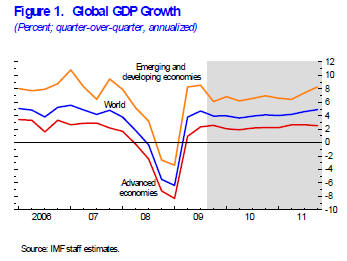
1. Global GDP Growth
The first chart in the report is the old global growth outlook chart. On GDP growth, the IMF revised it's forecast for the global economy to 3.9% in 2010, vs a previously forecast 3.1%. There really isn't anything surprising about it for those who've been paying attention.

The advanced economies took the biggest hit, and will return to growth eventually, albeit potentially lower then the average prior to the crisis. Then there's the emerging markets who did take a hit to a greater or lesser extent, but are set to recover back to high growth levels.

"In most advanced economies, the recovery is expected to remain sluggish by past standards, whereas in many emerging and developing economies, activity is expected to be relatively vigorous, largely driven by buoyant internal demand."


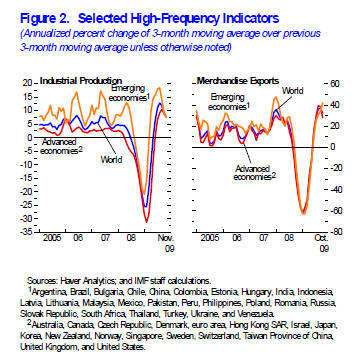
2. High-Frequency Indicators
The next chart to look at from the report is the high-frequency indicators: industrial production, and merchandise exports. Global trade is a great metric to monitor for gauging the level of economic activity in the world economy.

On trade, many countries have seen a recovery in trader off the lows or a "normalisation", indeed China has already reached the same levels it saw just prior to the crisis. Meanwhile industrial production, for now is underpinned by stimulus measures and the inventory cycle.

"In advanced economies, the beginning of a turn in the inventory cycle and the unexpected strength in U.S. consumption contributed to positive developments. Final domestic demand was very strong in key emerging and developing economies, although the turn in the inventory cycle and the normalization of global trade also played an important role."


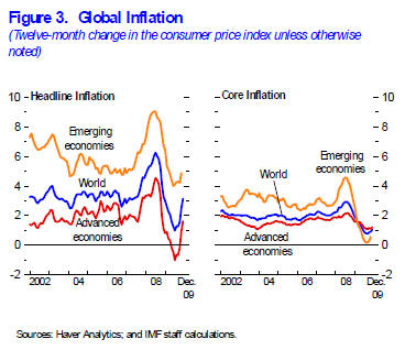
3. Global Inflation
For those that follow the Econ Grapher updates, it's no surprise to see the trends in inflation in the charts below. There has been a marked turnaround in headline inflation, boosted in part by a low comparison value, and similarly by the commodities cycle. What's also interesting to note though is that core inflation has also bottomed out and started to turn upwards.

The inflation piece of the puzzle is an interesting one, and while some (e.g. PIMCO) are suggesting deflation, others are warning about inflation. This plays into how monetary and fiscal policy will evolve over the next year, and it will be a difficult dilemma for policy makers to find the middle path.

"In the advanced economies, headline inflation is expected to pick up from zero in 2009 to 1¼ percent in 2010, as rebounding energy prices more than offset slowing labor costs. In emerging and developing economies, inflation is expected to edge up to 6¼ percent in 2010, as some of these economies may face growing upward pressures due to more limited economic slack and increased capital flows."


Before summing up it's worth reviewing what the IMF sees as the key Upside, and Downside risks.

Upside:
-"The reversal of the confidence crisis and the reduction in uncertainty may continue to foster a stronger-than-expected improvement in financial market sentiment and prompt a larger-than-expected rebound in capital flows, trade, and private demand."
-"New policy initiatives in the United States to reduce unemployment could provide a further impetus to both U.S. and global growth."

Downside:
-"A premature and incoherent exit from supportive policies may undermine global growth and its rebalancing."
-"Impaired financial systems and housing markets or rising unemployment in key advanced economies may hold back the recovery in household spending more than expected."
-"Rising concerns about worsening budgetary positions and fiscal sustainability could unsettle financial markets and stifle the recovery by raising the cost of borrowing for households and companies."
-"Rallying commodity prices may constrain the recovery in advanced economies."

Summary
The update to the World Economic Outlook has provided some interesting data and projections, as well as thoughts to consider. The upward revisions to the growth outlook are promising in terms of where 2010 may go, but it's clear by looking at the balance of risks, that there is still much more that can go wrong than right at this point.

In terms of how this ties in with investment strategy, it confirms a reasonably widely held view that emerging markets will outperform developed markets in the coming years (at least on an economic growth basis). It also adds to the macro risk-reward picture over the next couple of years in terms of how the recovery will evolve, and what may derail it (and therefore what to keep an eye out for).

Source:
1, 2, 3. IMF World Economic Outlook (WEO) Update http://www.imf.org/external/pubs/ft/weo/2010/update/01/index.htm

Article Source: http://econgrapher.site1.net.nz/WEOupdate-jan2010.html
Sunday, August 16, 2009

EU GDP... V?


Just a slight re-visitation of the previous post... I decided to look at it on a yearly basis; i.e. Q2 09 vs Q208 etc. What came out of the graph works was a decidedly downward trend in growth, with a bit of acceleration in the most recent observations. What this says is that while the quarterly growth recession may look near an end, there's still a wee way to go before things are actually in total looking better. It's like stock prices if you fall from $100 to $50 you need much more than a 50% gain to get back where you came from, and when you're that low it doesn't take much to get what looks like a good gain in % terms.

So not out of the woods yet... if anything (to carry the metaphor) we're almost at the top of the mountain in the woods.. eventually we'll come back down and then get into the woods before we can get out! (though maybe spelunking would bear more apt description than mountaineering!)

-Econ Grapher